I’m Nicholas Johnson, a user experience designer with almost 20 years of experience. For the past 10 years I’ve been a public servant at the Consumer Financial Protection Bureau (CFPB), where I’ve researched, designed, and developed products to help Americans get a fair shake in their finances.
The projects here are only a few of my favorite highlights that show the range of my work, from foundational research through design and development. If you’d like to talk more, just shoot me an email at niq@niqjohnson.com.
One of the CFPB’s most important functions is to take complaints from Americans when they have problems with a financial instution, like their bank. We’ve handled almost 7 million complaints since 2012, which have led to billions of dollars in restitution.
As successful as our complaint system has been so far, the research I helped design and conduct showed how it could be better both for consumers submitting complaints and companies responding to them. In a year-long project, my team and I designed new print and online complaint forms, a new portal for consumers to track the progress of their complaint, a new portal for companies to view and respond to complaints, and new portals for government regulators and Congressional offices to access our complaint data. I led the design on all four portals with rapid prototyping and user research.
Some improvements were obvious. Despite almost half of our traffic coming from phones and tablets, our old consumer complaint portal and forms weren’t responsive. On the other side of the process, financial companies told us that the old portal they used to view and respond to complaints was difficult to decipher, full of confusingly ordered information and error-prone forms. I worked with the larger team to design and develop a totally responsive consumer portal and submission form and a completely redesigned, logically organized company complaint portal.
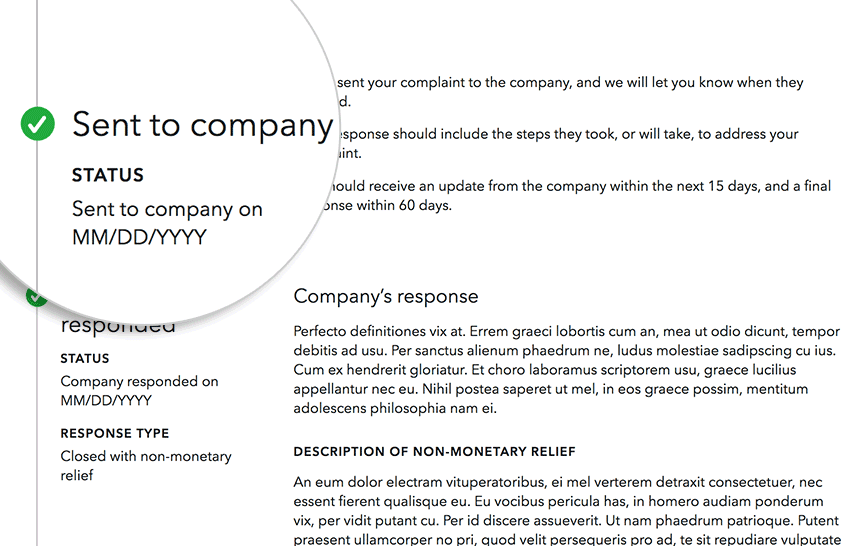
Since the new complaint system launched several years ago, I’ve continued to iterate. The most recent round of user research I led showed that consumers didn’t always understand what to expect when submitting a complaint. To help with that, I prototyped improvments, like a visual depiction of the process, and tested them to see how effective they were (very!).
My team and I worked hard to simplify the complaint process for consumers. With the old system, our call center was inundated with calls from consumers confused about what was happening with their complaint. To alleviate much of that confusion, I designed a simple complaint timeline where consumers can see the history and status of their complaint.
Easy for companies
When companies logged into the old complaint portal, they saw a jumbled list of complaints that all looked equally important. That wasn’t an accurate view—complaints that required a response in the next few days needed attention most urgently. I designed a dashboard in the new portal to give companies a more prioritized view of their complaint queue.
Helping homebuyers understand mortgage forms
Know Before You Owe
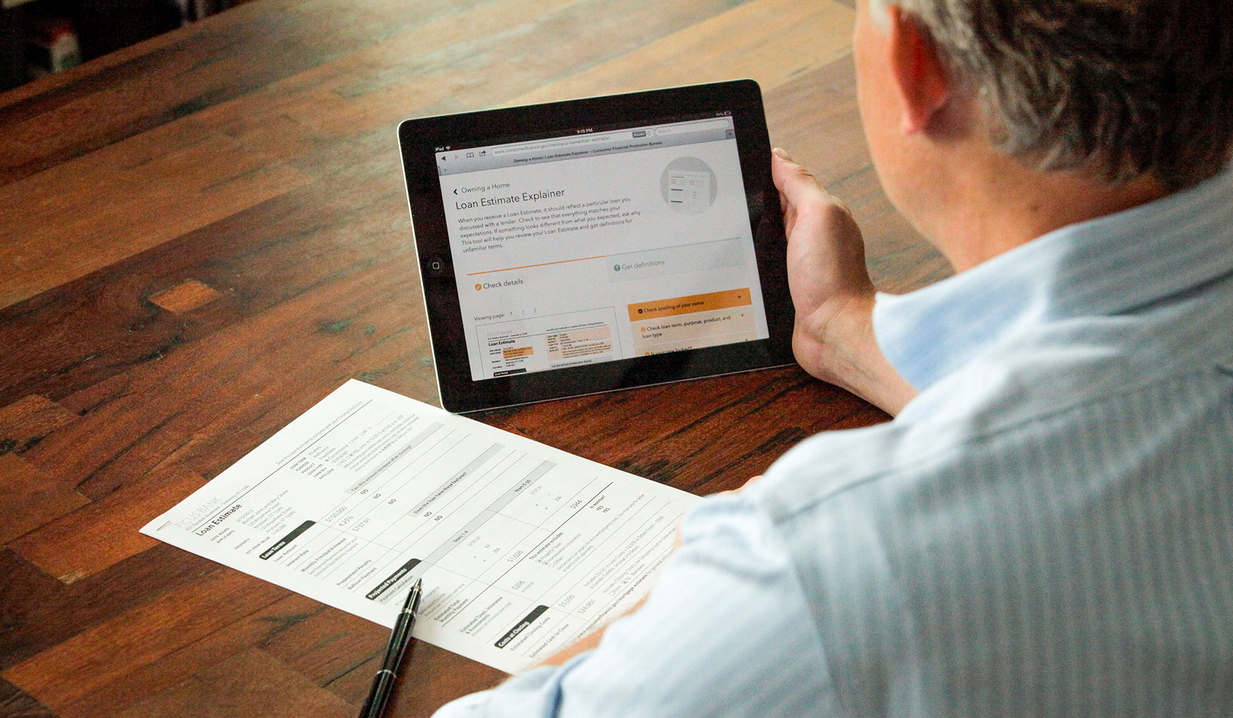
Millions of Americans took out a mortgage last year. To help homebuyers better understand what they’re committing to, the CFPB spent two years redesigning the forms that anyone who applies for or closes on a mortgage will get from their lender. These new forms are substantially clearer than their predecessors, but our research showed that even the best-designed forms are still going to leave some homebuyers with questions.
I helped design companion web pages that answer common questions homebuyers have about both forms. In 2024 over 160,000 homebuyers visted the two form explainer pages, the loan estimate explainer and the closing disclosure explainer.
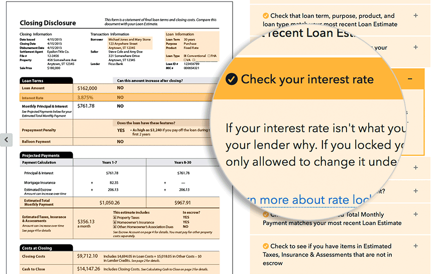
The mortgage form explainers are meant to be companions to the forms themselves, so I designed the explainer interface to make glancing back and forth between form and screen super easy. Little touches—like highlighting the part of the form your question relates to—help you keep your place as you work.
I’m proud of how quickly my team and I were able to make the form explainers. The majority of work was done during a two-week, hackathon-style sprint. I decided early on to look at the tight deadline as an advantage instead of a constraint; having only two weeks let me be ruthless in cutting feature ideas that weren’t absolutely essential.
Previous user research showed that, while many first-time homebuyers understand the information on their mortgage forms, they often don’t know what to do if they spot an error (or if what they’ve spotted is even an error at all). That’s why I centered the user interface on clear, actionable information in the explainers, like highlighting exactly which numbers were negotiable with the lender.
Wide use
The URLs to the form explainers are on forms that all mortgage lenders are required to give anyone who applies for or closes on a mortgage. Once the initial thrill of “millions of people might see this thing we made!” wore off, I took the responsibility of designing a product intended for such a big audience very seriously. We worked hard to make sure that our tool would be accessible to users of all abilities and on all devices.
Educating vulnerable students about debt
Paying for College
When I went to college, I didn’t know anything about student loans, and I only managed to graduate without tons of debt through blind luck.
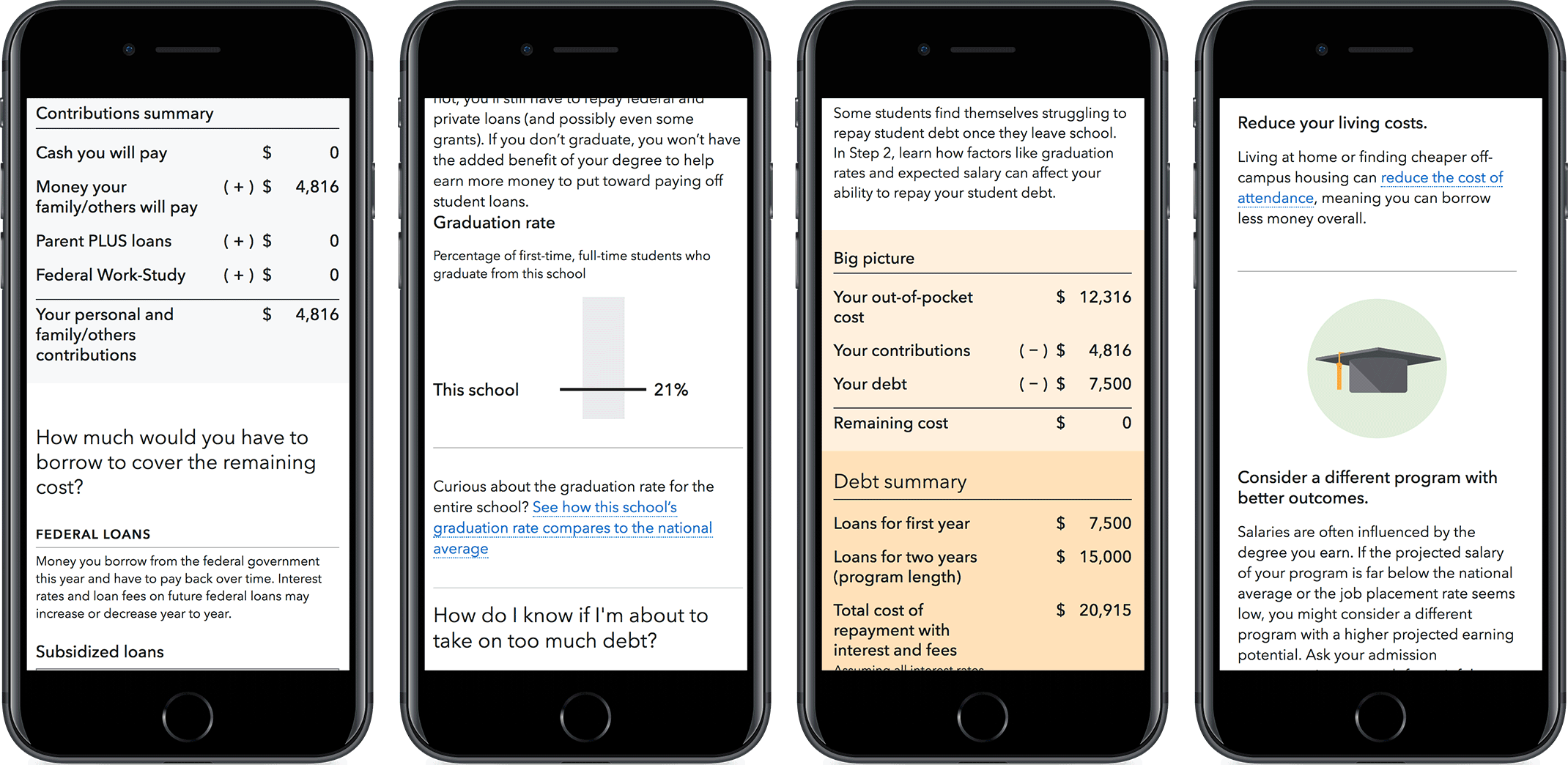
Not all students are so lucky, though, especially “non-traditional” students looking to attend certain for-profit schools that a CFPB investigation found didn’t always act in the best interest of their students. As part of a settlement with those schools, my team created a tool to help students better evaluate the risks and rewards of taking out loans to attend their school. For many of these students, our tool may be the only full view of their loan package they’ll ever see before they have to start paying off their debt.
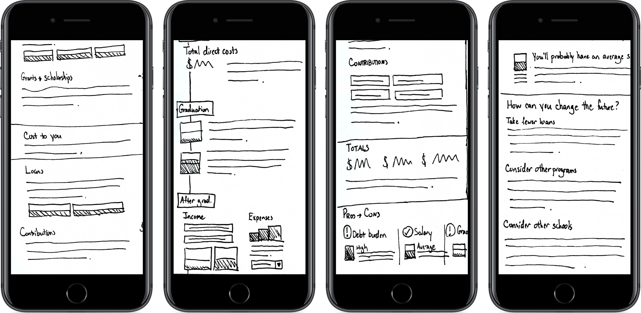
It was a big challenge to design a comprehensive tool that doesn’t feel overwhelming. To make sure we were presenting the right information in the right way, I and another user experience designer began the project with a series of interviews with students at for-profit schools that helped us better understand their financial aid frustrations. I used what we learned from those students to design the tool. One big lesson: students are likely to use their phones to view their disclosures, so I designed mobile first, starting with sketches to let us try out new ideas super quickly (move the slider above to see how my sketches turned into the final designs). Then we validated the tool with a round of usability testing that I helped design.
In between those rounds of research, I had the chance to do a lot of front-end development on the tool. Writing production-quality HTML, CSS, and JavaScript suited me just fine; I think how a tool like this is coded has a huge effect on its user experience, so I loved having the chance to dig into the code to help get everything working just right.
The tool has helped thousands of students at for-profit schools better understand the impact their student loans will have on their futures. It’s been hugely gratifying to hear some of the comments these students have left us about how our tool has helped them make a more informed student loan decisions.
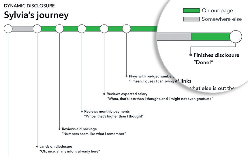
We found in our interviews with students that they researched financial aid over many sources and many weeks. We wanted our tool to fit seamlessly into their research, so I made journey maps to guide the team. The journey maps were especially critical in helping us adapt the tool to some common preconceptions. For example, students were likely to come to our tool after a meeting with an overly optimistic financial aid counselor, so we focused a lot of the content on dispelling common misinformation about student loans.
Simple visualizations
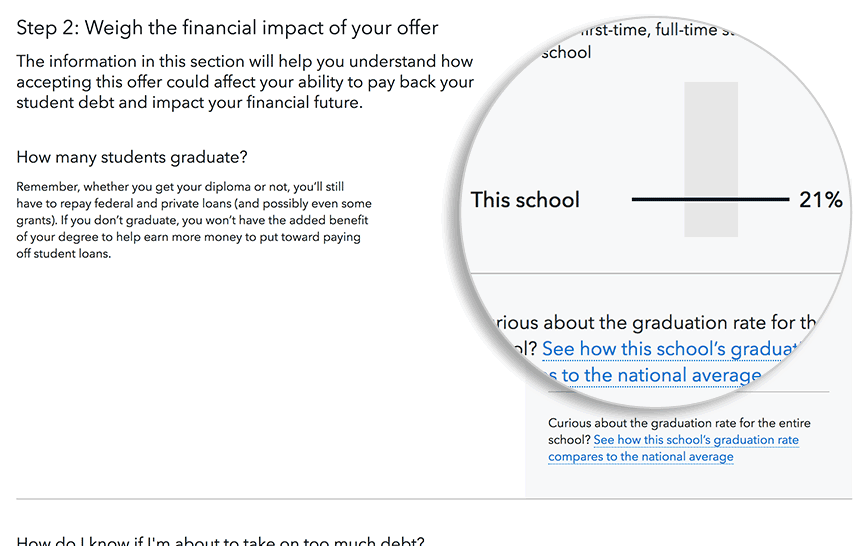
Deciding if you have a good financial aid offer is more complicated than just looking at loans and scholarships. You need to juxtapose those numbers with information about your school to figure out if the offer is a good fit for you. For example, you’d be more wary of taking out a lot of loans to go to a school with a low graduation rate than you would for one where getting a degree is more likely. I helped design simple graphs to display those kinds of school metrics to help students figure out the true value of accepting their aid offer.
Demystifying Social Security retirement benefits
Planning for Retirement
For this project, my team was given the task of helping older Americans understand how the age they claim their Social Security retirement benefits can impact their finances for the rest of their lives. It’s a surprisingly byzantine and controversial subject that not many organizations want to take on. But my CFPB team did.
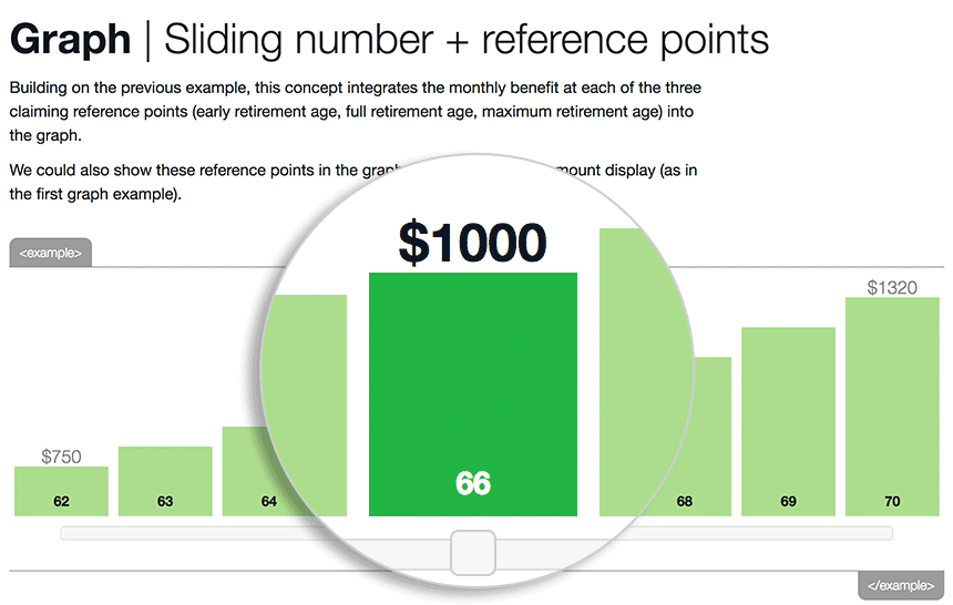
The tool we built, Before You Claim, boils down dozens of regulations and calculations into a couple of input fields, a big graph, and some very readable content. It’s helped hundreds of thousands of Americans better understand when to claim their benefits.
It took a lot of work to make something that simple, and there’s a lot of behavioral science built in. For example, our research showed many Americans choose to start drawing Social Security at age 62 partly because 62 is the age they subconsciously associate with Social Security. Our graph starts with age 67 selected to help reframe claiming at age 62 as a penalty rather than a default.
The user tests I helped plan throughout the project both validated our efforts to simplify a complex topic and suggested ways to make the tool even better. For instance, participants in our first round of testing almost always understood the information shown in the big bar graph but frequently did not realize that it was interactive. That led us to refine the design of the graph by making the slider more obvious. Participants in later rounds of testing interacted with it much more often.
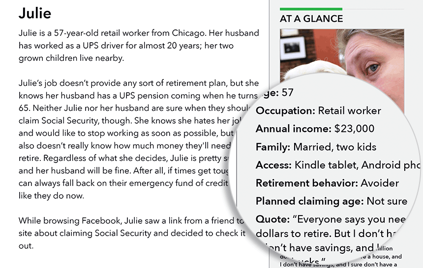
Our user research showed that “retirement” could mean vastly different things to different people. One person might think of retirement and panic—“I’ll never have enough money!”—while another might be itching to retire as soon as possible. Since our tool had to work for all kinds of users, I created several personas (complete with citations to our research) we used to make sure we weren’t leaving any of our users out.
Isolated iteration
Making a complex topic like Social Security feel simple wasn’t an easy task. Stripping unnecessary information out of the interface was crucial, but so was making the information we left in easily understandable. To do that, I iteratively prototyped small parts of the interface until they were perfect. For example, I went through dozens of iterations of the benefit graph, testing out different combinations of interactions, labels, and chart types.
Learning a little more
A few other things about me
Remote work
I’ve been a remote employee for 10 years. Not being face to face with my coworkers every day makes clear communication (especially written communication) even more important than usual. I’m pretty good at that kind of communication, as this GitHub issue about creating a style guide for tables hopefully shows.
I have a master’s in information science, so I’m well versed in research-based design. Whenever I can, I back up my design decisions with evidence from scholarly research, user studies, analytics, A/B tests and other methods appropriate to the projects I’m working on.
Learning
If there’s one thing I leanred from going to a liberal arts school (go, Grinnell!), it’s how important it is to always be learning. Right now I’m learning how to build better circuits with a Raspberry Pi so I can make a sweet fingerprint-activated lock for a secret hideout.